STRATZ
Overview
STRATZ Esports is an advanced analytics platform for the popular Dota 2, by Valve Software.
In a small industry dominated by two primary competitors, I increased the STRATZ user count by 300% over the course of a three-year intensive redesign.
Deliverables
UI, UX, Videos, Brand Assets, Presentations
I increased the STRATZ user count by 300% over the course of a three-year intensive redesign.
Problem & Solution
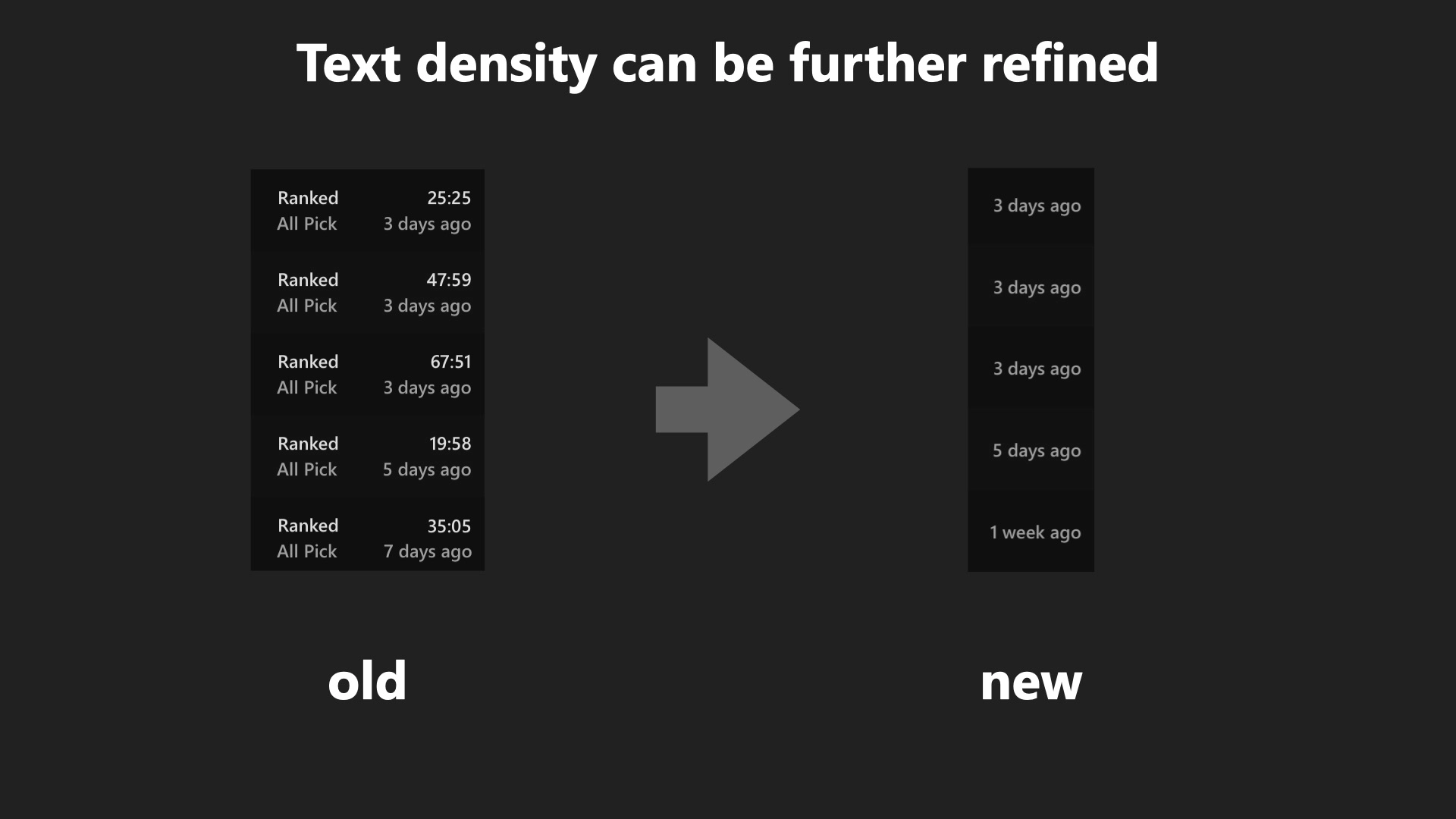
STRATZ contains more data than any of their competitors, but the usability of that data was hurt by overburdened interfaces.
Every page featured dozens of stats and buttons, making even the simplest screens challenging to read. This stifled adoption, especially when compared to the more approachable interfaces of competing products.
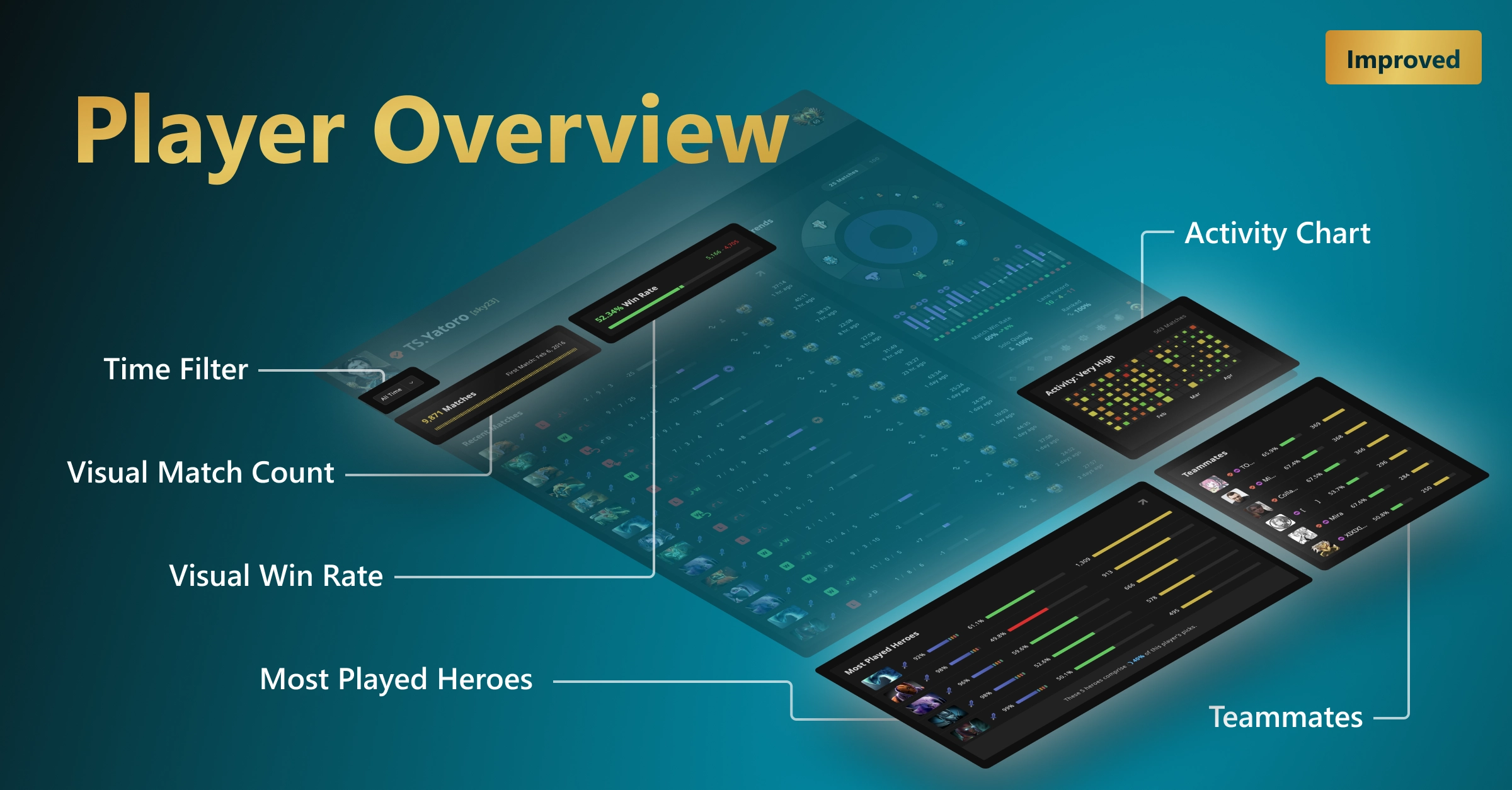
To address this I defined a simple redesign strategy: Focus each screen on one specific use case at a time. Even if that meant less information available in a given view, the data that remains is now elevated in importance.
This strategy, coupled with a fresh UI, allows users to find what they’re looking for faster.
Research
Users
STRATZ was built for Dota players, and the visual cues in a game of Dota 2 are rich and plentiful. Players build up thousands of hours of split-second recognition of the hundreds of icons, thumbnails, and colors used throughout the game's interface.
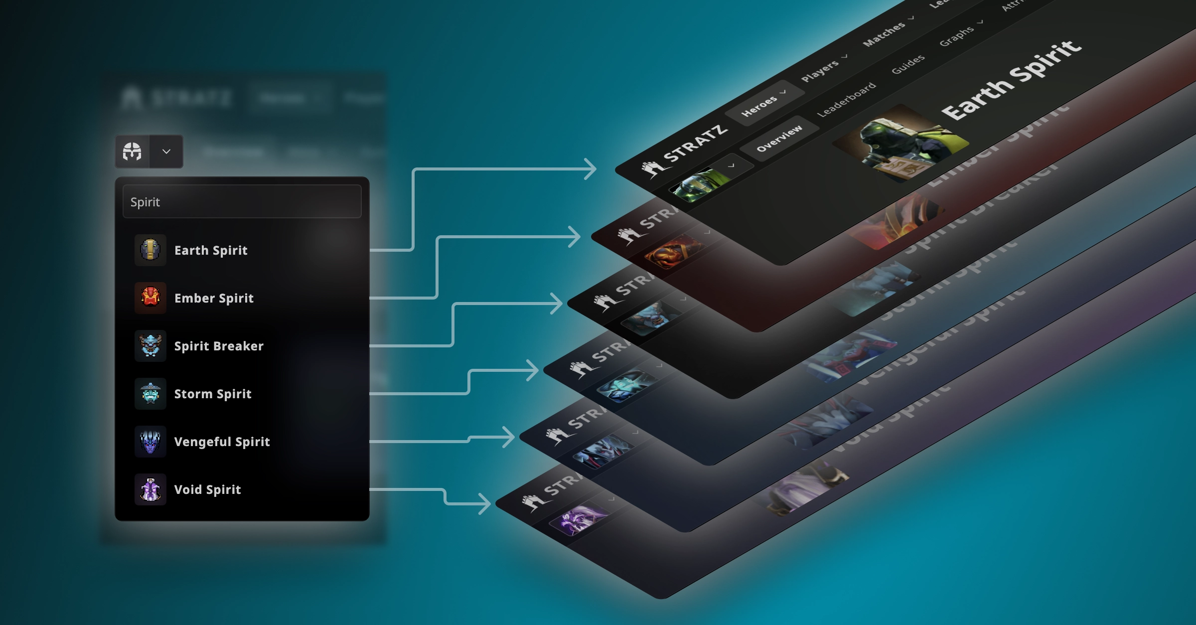
Therefore I attempted to use graphics and iconography directly from the game wherever possible, so that many fundamental data points can be immediately familiar and recognizable to the target audience.
Demographics
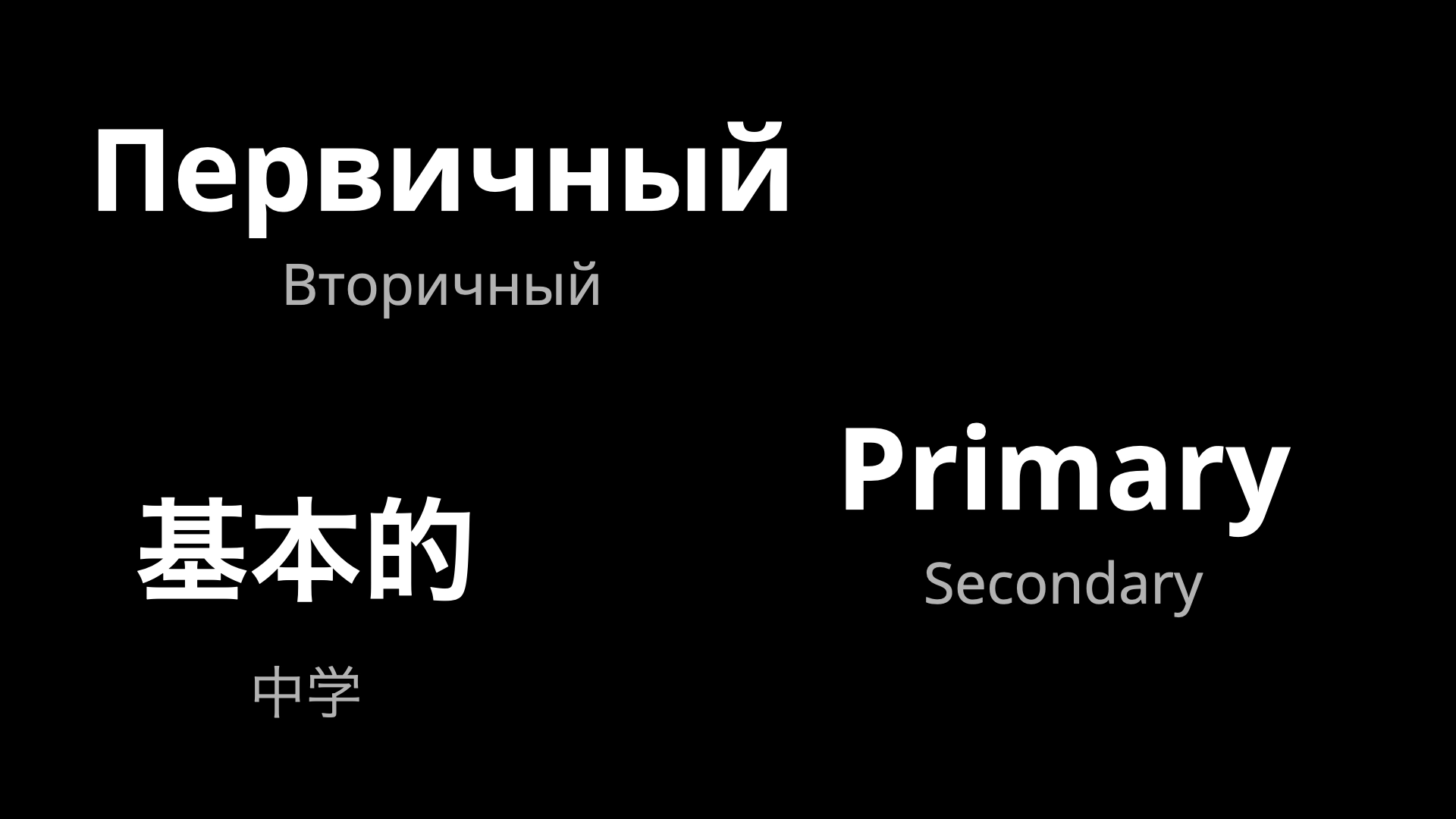
The majority of STRATZ traffic originates from outside the United States. Therefore localization needed to be a priority, especially with languages popular in the Dota scene such as Russian and Chinese.
Interviews
Over time, I conducted a number of interviews with STRATZ users, Dota 2 players, and content creators. Most interviews took place informally to get a sense of people’s opinions of the STRATZ brand, what users’ greatest pain points were, and what they prefer about competitors that kept them from using STRATZ instead.
Many of the responses emphasized that the greatest pain point was the convoluted UI and its poor usability. As I continued to gather feedback corresponding with new feature releases, the responses have been overwhelmingly positive.
Competition
| Dotabuff | OpenDota | STRATZ | |
|---|---|---|---|
| Overview | ✓ | ✓ | ✓ |
| Guides | ✓ | ||
| Items | ✓ | ✓ | ✓ |
| Counters | ✓ | ✓ | |
| Clips | ✓ | ||
| Ability Builds | ✓ | ||
| Abilities | ✓ | ✓ | ✓ |
| Trends | ✓ | ||
| Top Players | ✓ | ✓ | |
| Cosmetics | ✓ | ||
| Benchmarks | ✓ | ||
| Recent Matches | ✓ | ||
| Durations | ✓ | ||
| Coverage | 83% | 50% | 42% |
STRATZ faces competition from two main platforms: Dotabuff, and OpenDota.
While their designs differ, both platforms offer the ability to view Dota stats through web-based interfaces. Dotabuff has first-mover advantage and is the top name in Dota analytics, while OpenDota is an open-source community driven project.
In order to be considered the pinnacle of esports analytics, STRATZ must achieve at minimum feature parity with these platforms, otherwise consumers with a particular use-case in mind will stay with the platform that they know serves their needs.
As I progressed through redesigning the many sections on STRATZ, I conducted regular competitor research, to discover which key features in a given section are not available on STRATZ. This allowed me to guide the feature development towards addressing these gaps in our functionality.
One of the largest gaps in feature parity I discovered was the inability for users to discover and learn from hero guides. Hero Guides are not available on OpenDota, meaning all users wanting guides will be driven directly to Dotabuff, STRATZ’s largest competitor.
Upon learning this, I spearheaded a two-week design intensive to create our own Guides system, aiming to go even further in terms of functionality than what Dotabuff offers.
The STRATZ hero guides have since gone on to become the 5th most popular feature on the site.
Information Architecture
For a project as large as STRATZ, there need to be systems in place to organize what needs to be done and when.
Site Map
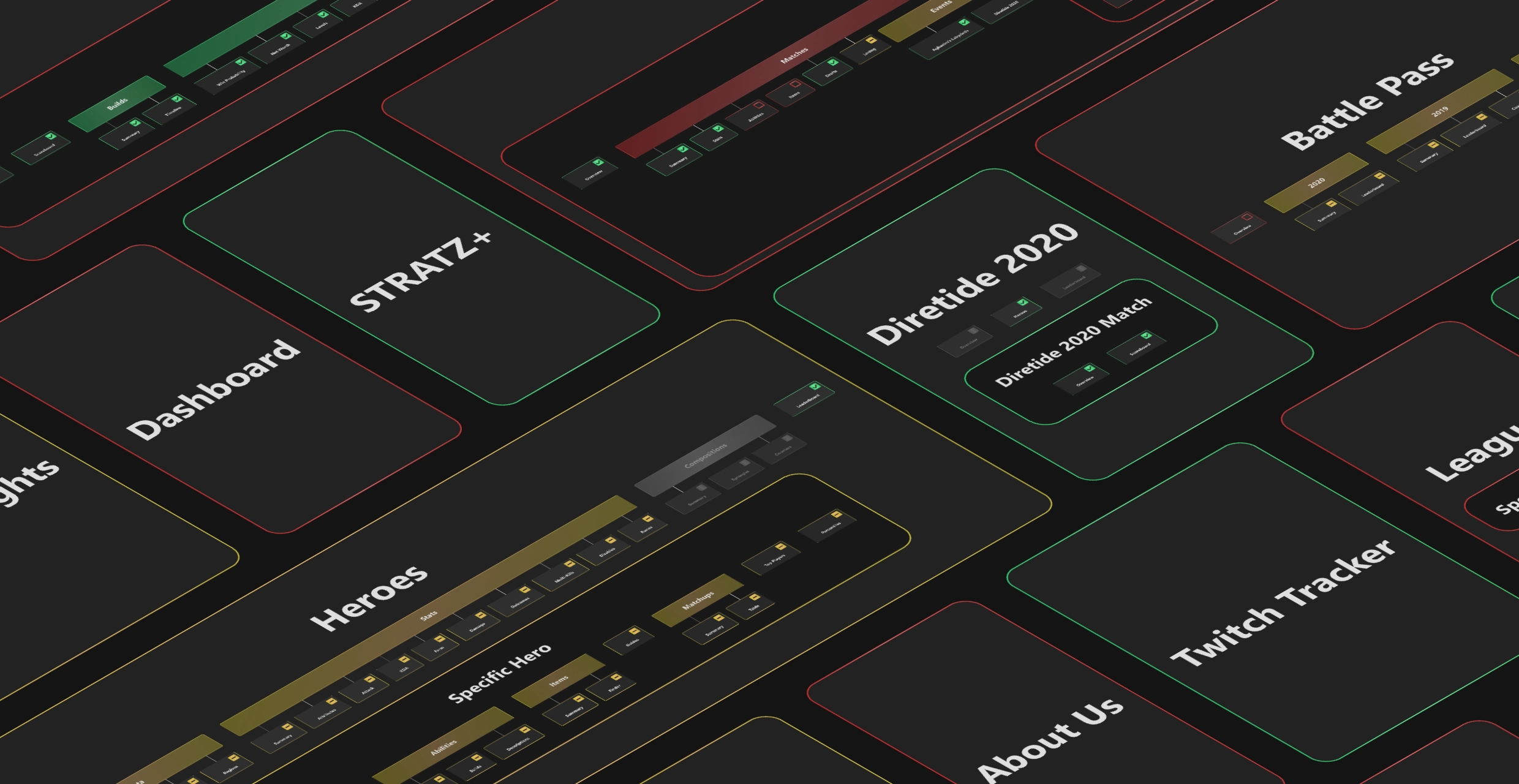
For clarity, and ease of sharing goals with the rest of the team, I put together a color-coded site map, visualizing all the sections of STRATZ, which pieces had been completed, which were still in the design and ideation phase, and which features are currently missing from our roadmap. (The latter was assisted by the competitor research described above.) While this map is not presented in its entirety here for privacy reasons, it was a useful tool in being able to picture the full scope of the project as it developed.
User Task Flow
While much of the day-to-day focus of the STRATZ project was on the redesign and development of individual sections across the platform, I was also mindful of the overall user flows. How many clicks does it take to access a certain key page? How much time is spent waiting for pages to load? All of these factors add to (or detract from) the user experience, and I took care to refine these flows over time.
I created this animation featuring an overhaul to the site navigation, where I put special attention on the user’s ability to reach any page in 4 clicks or fewer.
Wireframes

Much of the dynamic of the STRATZ team has required higher-fidelity prototypes. There are several reasons for this, chiefly among them the need to convince all relevant stakeholders of the direction.
That said, for some of the larger page redesigns, I prepared several sketches and wireframes to plot out the direction in a flexible manner.
Design System
Over the course of my time with STRATZ, I built out a design library, refining their existing UI elements, as well as adding new ones where necessary.
Iconography
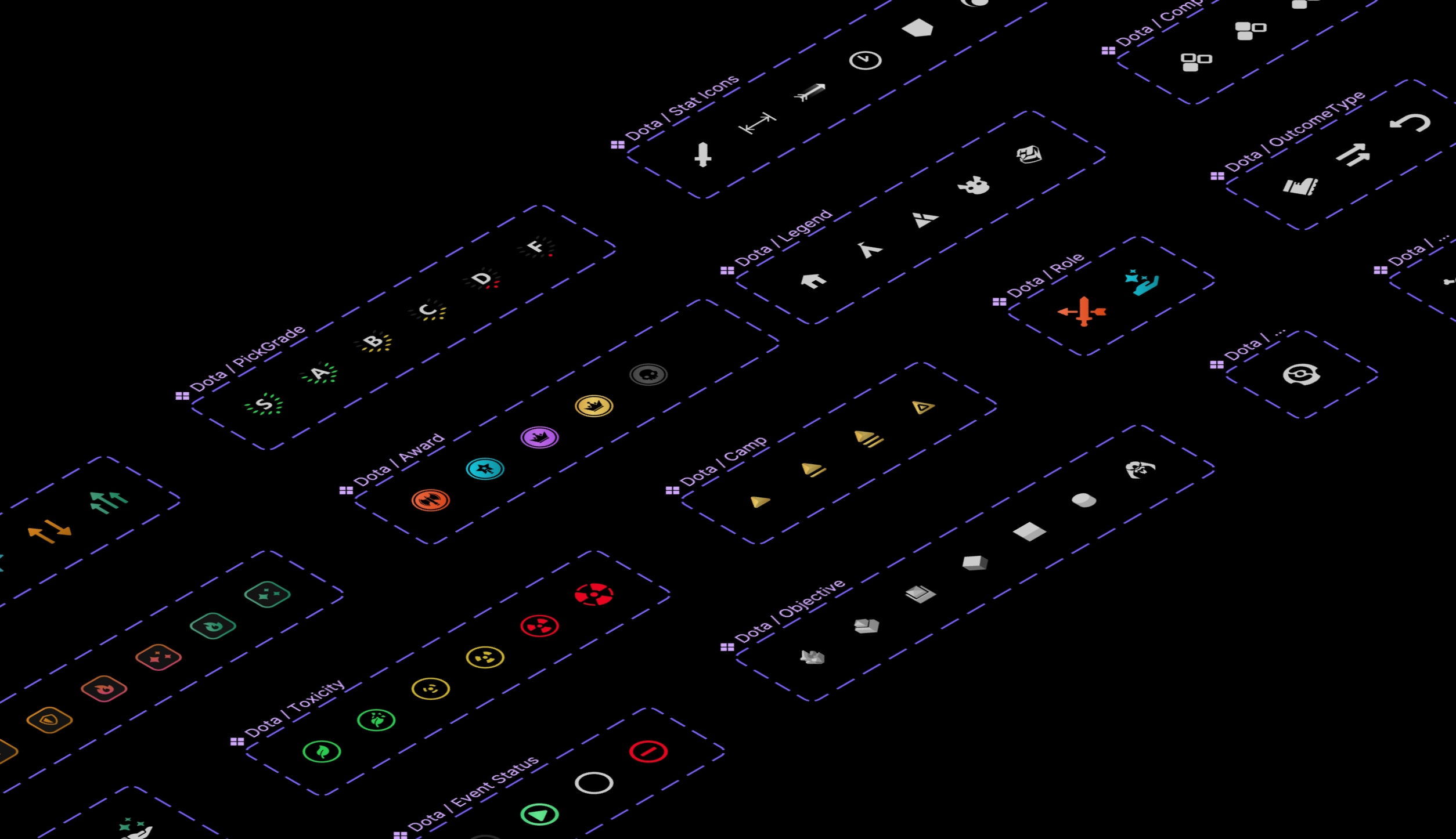
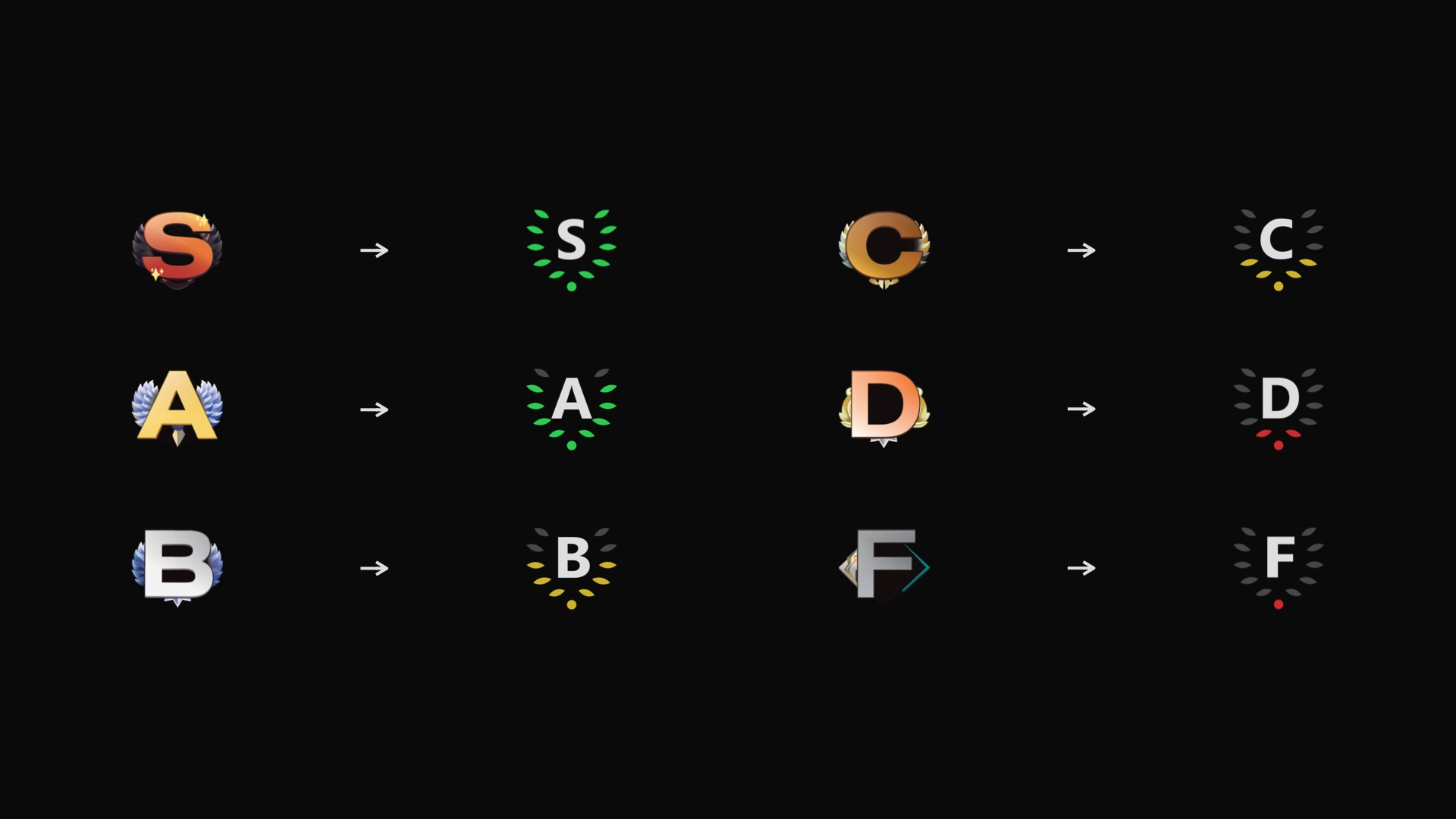
Many icons and visuals are used within Dota 2. I built off of this foundation and refined the iconography across STRATZ to be visually consistent both with itself and with their in-game counterparts.
Typography

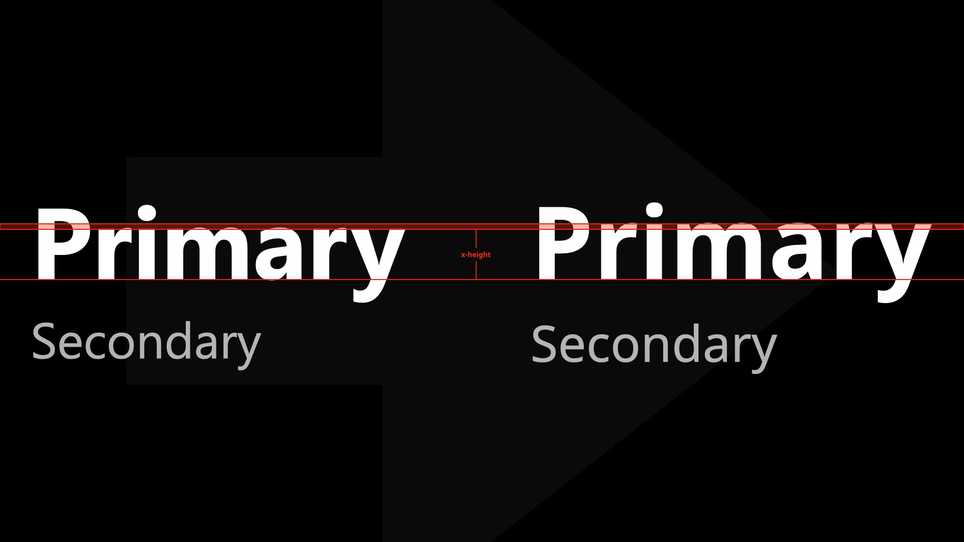
The type systems used across the site originally had several legibility concerns. They were too thin, and there was not enough variance in size, weight, and color to make key points stand out. Additionally, many pieces of content were rendered in all-caps, which while not fundamentally an issue, added additional noise to an already overwhelmed experience.
I defined a new set of sizes and weights for all our type styles, paying careful attention to contrast at all times. Additionally, I switched the main typeface family to Noto Sans, which allowed for increased legibility as well as visually-consistent localization across all our supported languages.
Color
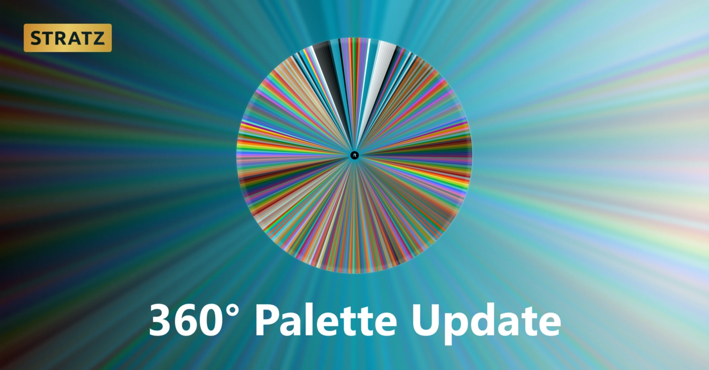
The color palette of STRATZ already trended towards blue tones because of the logo, so I leaned into that, creating sets of blue gradients for the background colors of our promo material. The dark blue highlight color currently in use didn’t render well on the dark backgrounds of the interface, so I switched that to a bright gold.
I also made minor and major adjustments to the hundreds of other colors used across the site, to improve contrast and comply with WCAG guidelines.
Accessibility
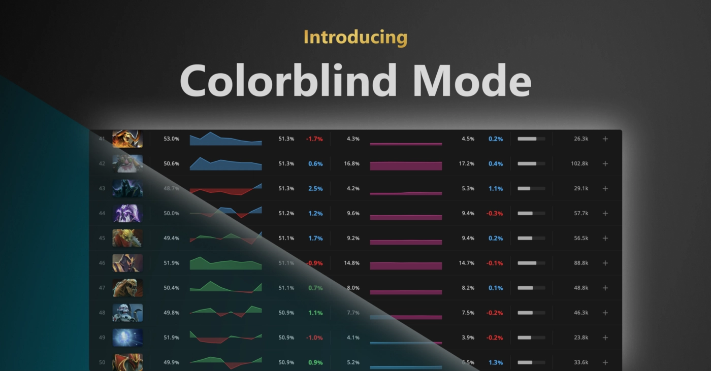
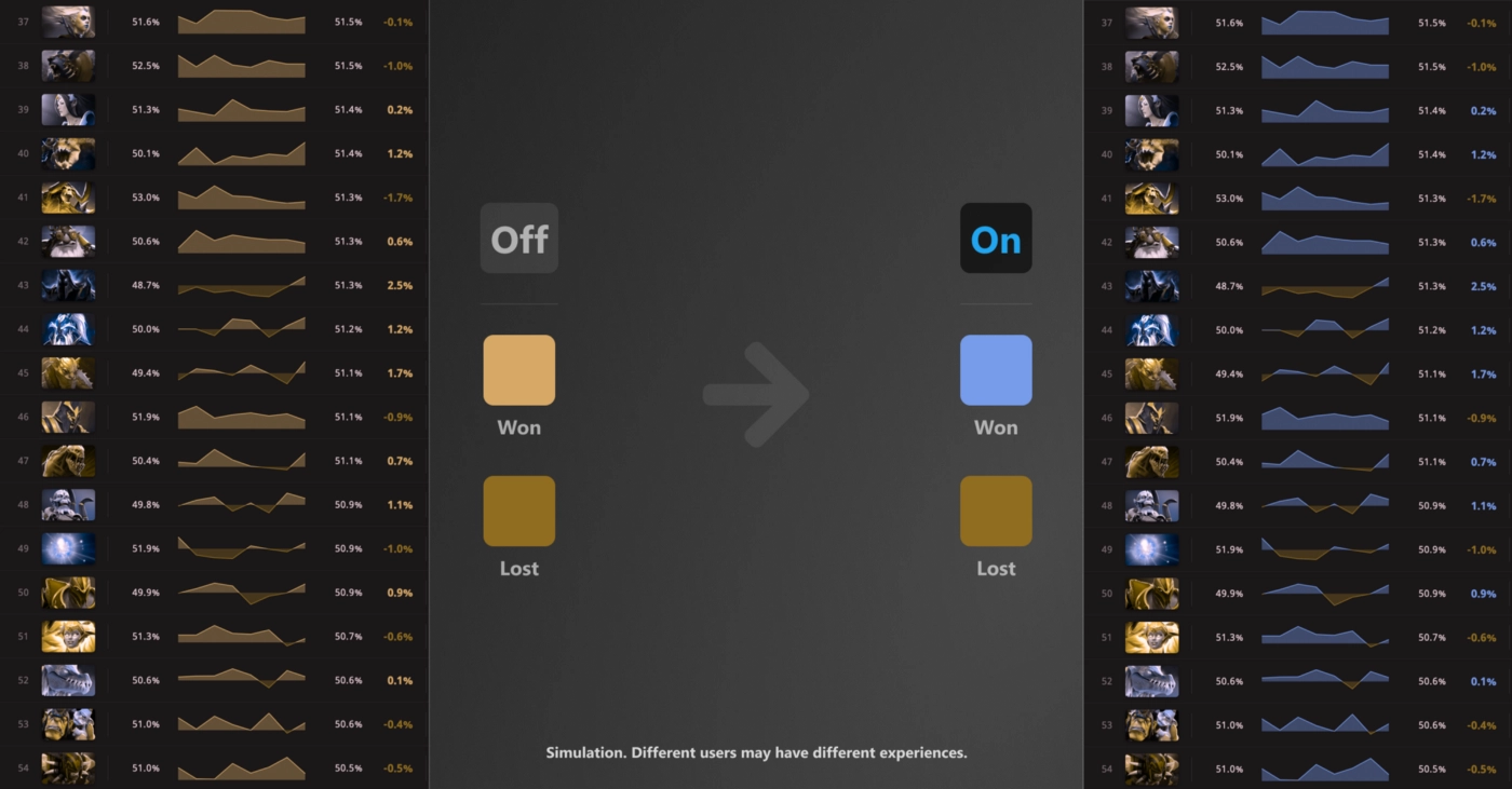
Accessibility and universal design are concepts I hold close in every project I undertake. For STRATZ, in addition to the color adjustments described above, I also championed several accessibility-minded features:
I supported the creation of a three-tone theming system, allowing users to select between “Midnight” (black background), “Twilight” (dark gray background), and “Daylight” (white background) themes, so users can select a theme that works best for their personal contrast comfort thresholds.
I also created a “Colorblind” mode for the site, which adjusts the site palette, targeting colors frequently confused by people with colorblindness.
Stakeholder Presentations
After building a new or redesigned page, I would prepare a presentation to introduce the new concepts to the rest of the team.
As a small team, every member functioned as a stakeholder in the final product, so it was important to get everyone as close to aligned with the vision as possible before a feature could be shipped. (Of course no group can agree in 100% of circumstances, but it is important to the company culture and team health that everyone has a voice in the product direction.)
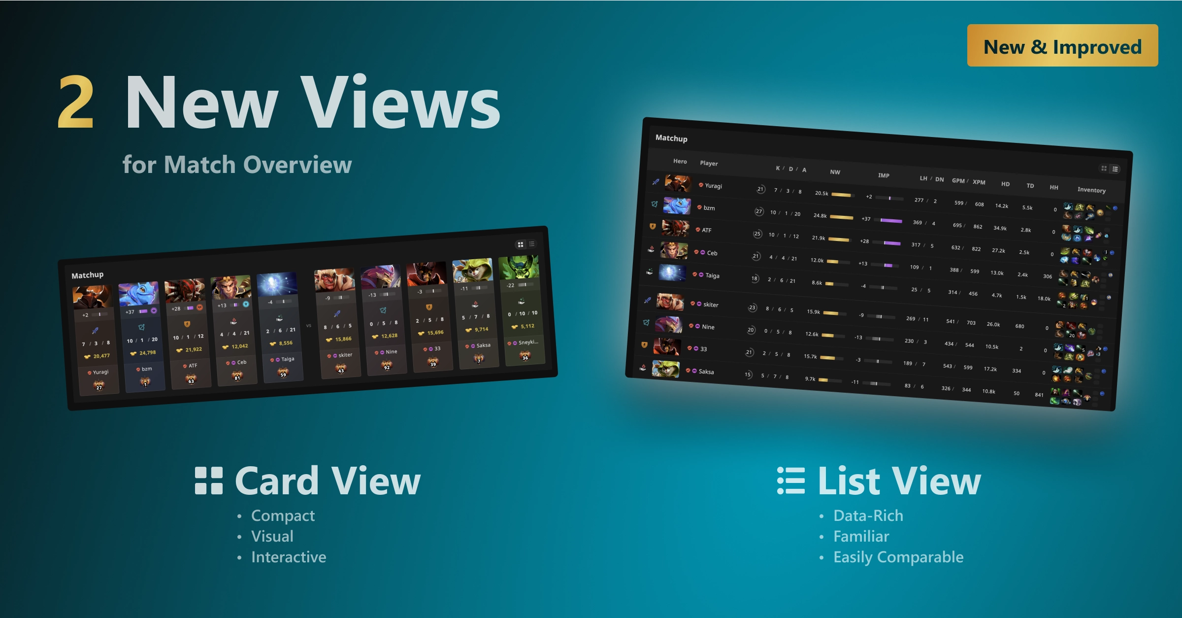
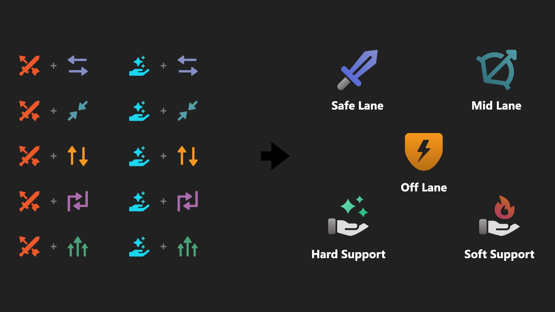
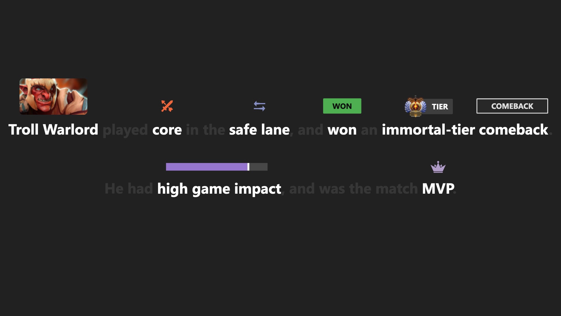
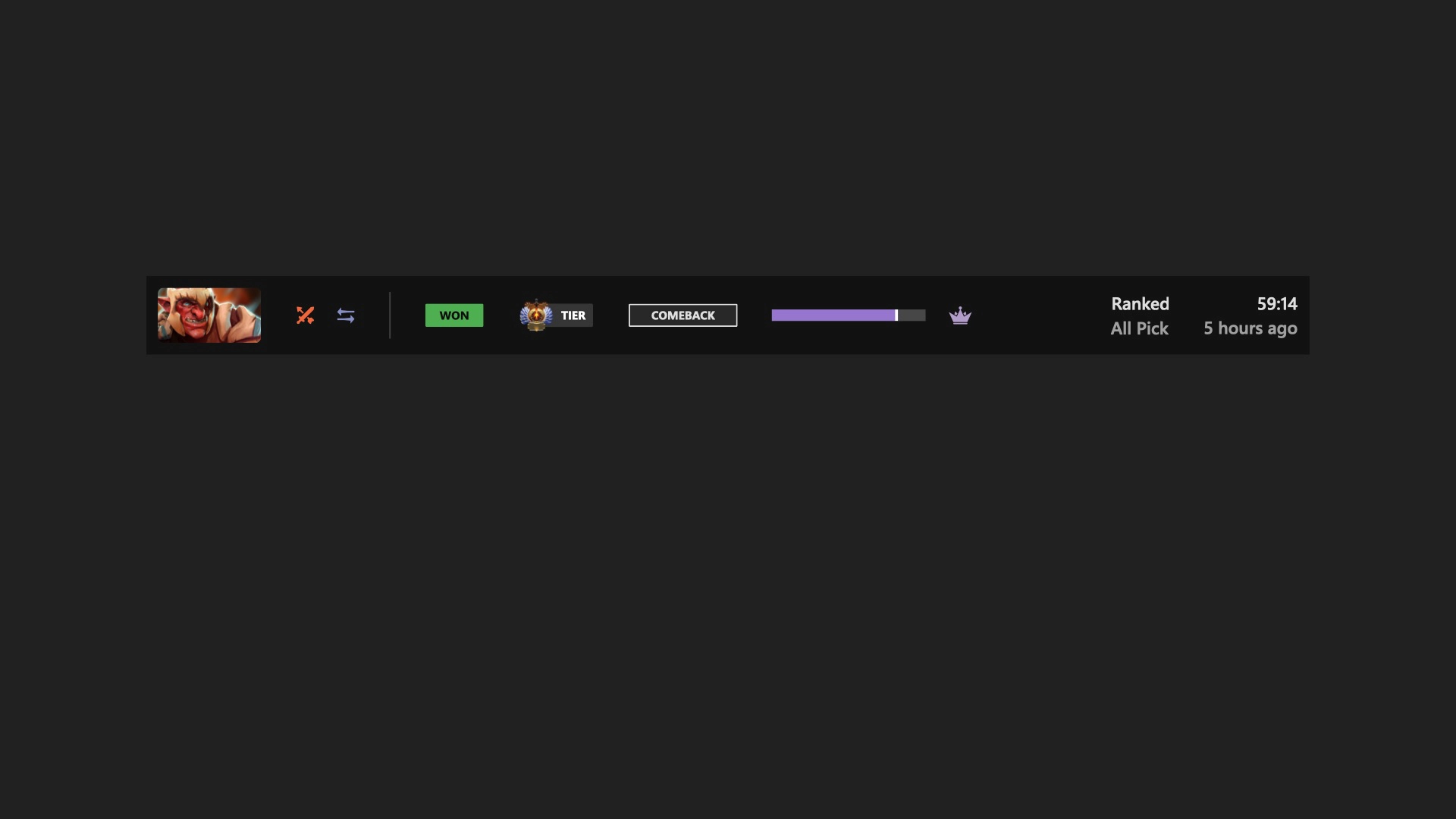
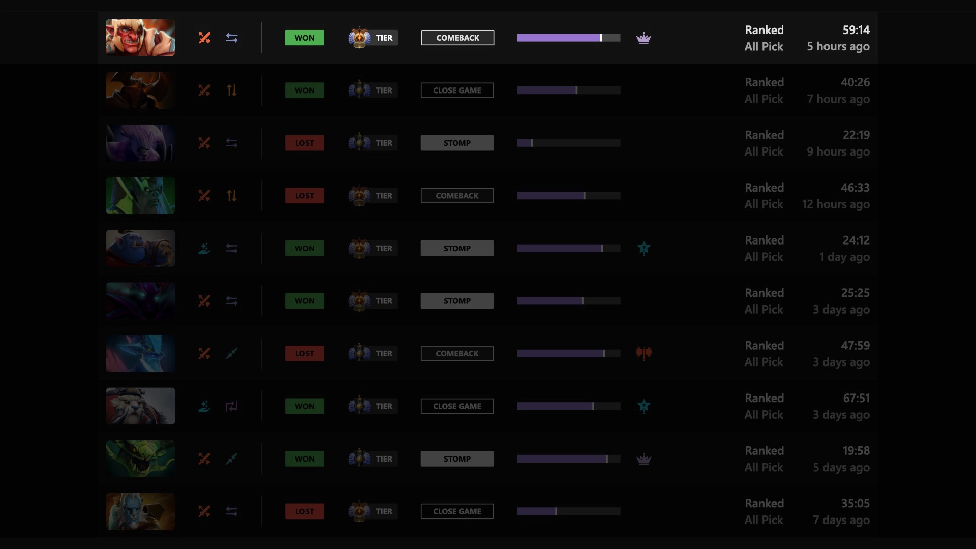
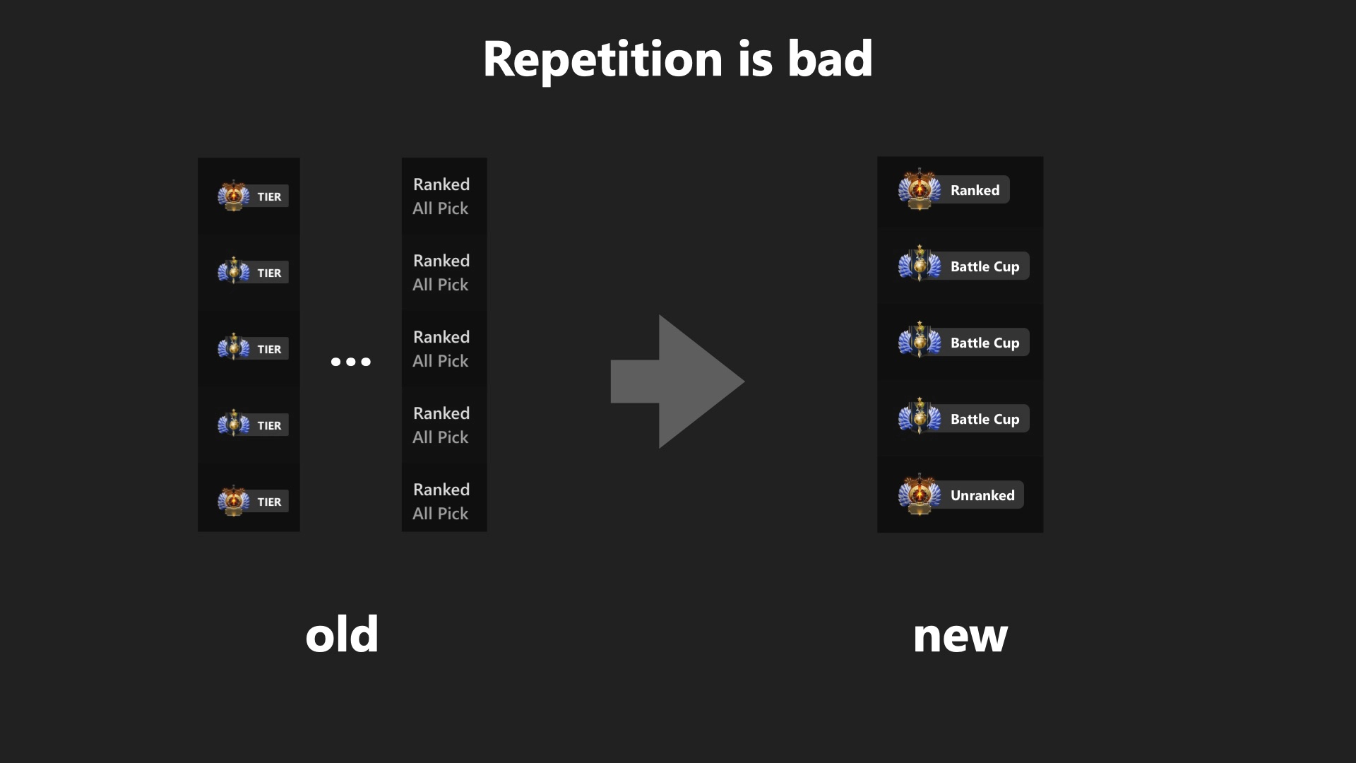
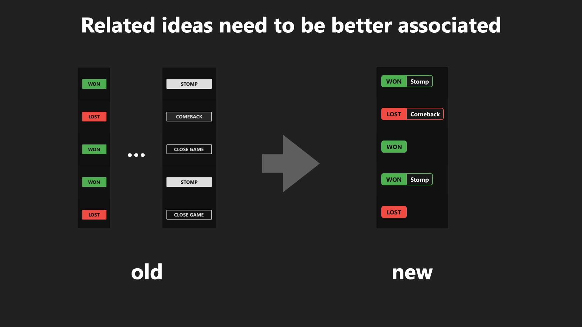
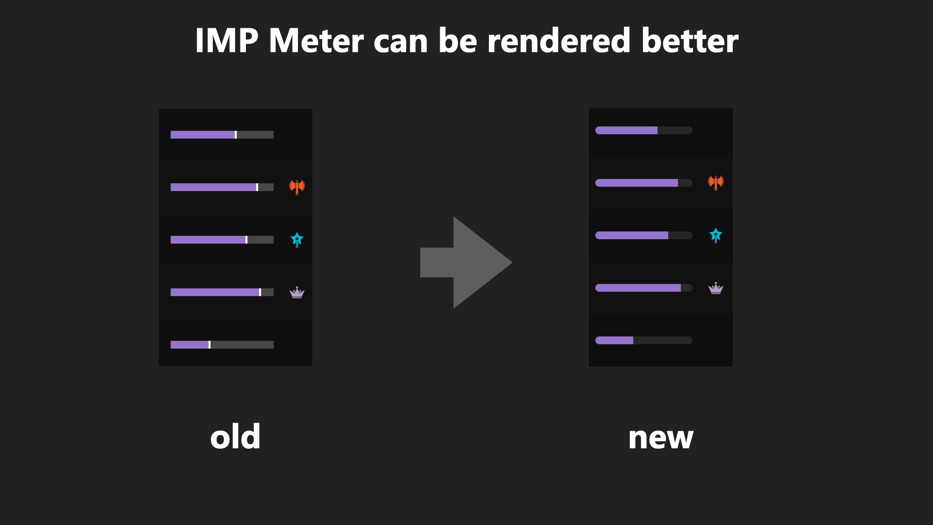
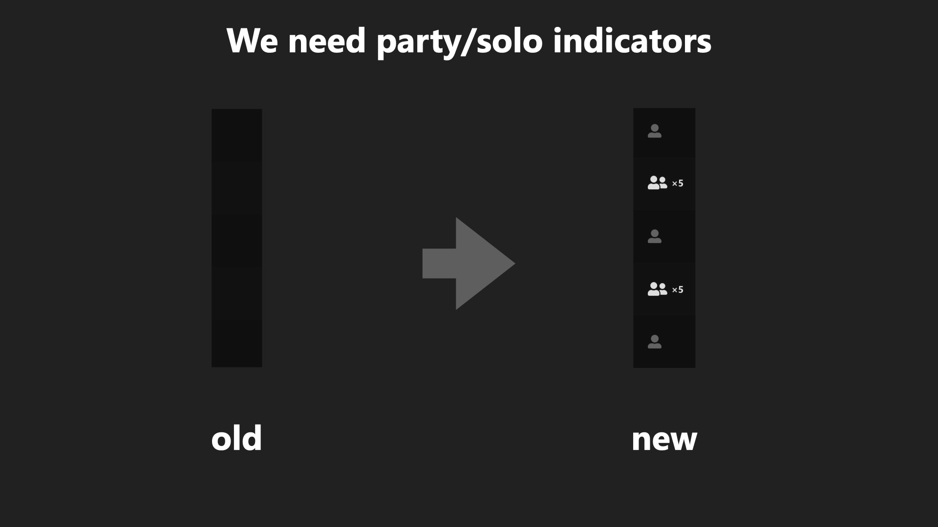
The example shown here is an excerpt of one of the first pitch decks I prepared for the team. In it, I demonstrate how the strategy for a hero match row can be abstracted from a sentence-based structure into icon and visual form. Therefore, when all the icons are arranged in a table, they can read fluidly across both the X and Y axes.
Revisions
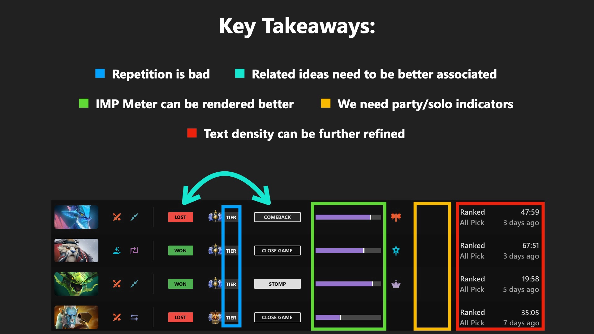
After a team review, I went through a secondary design phase, parsing the feedback, and updating the design in relevant places. This multi-phase approach allowed for a much higher-quality final product to be prepared before reaching the main site.
External Feedback
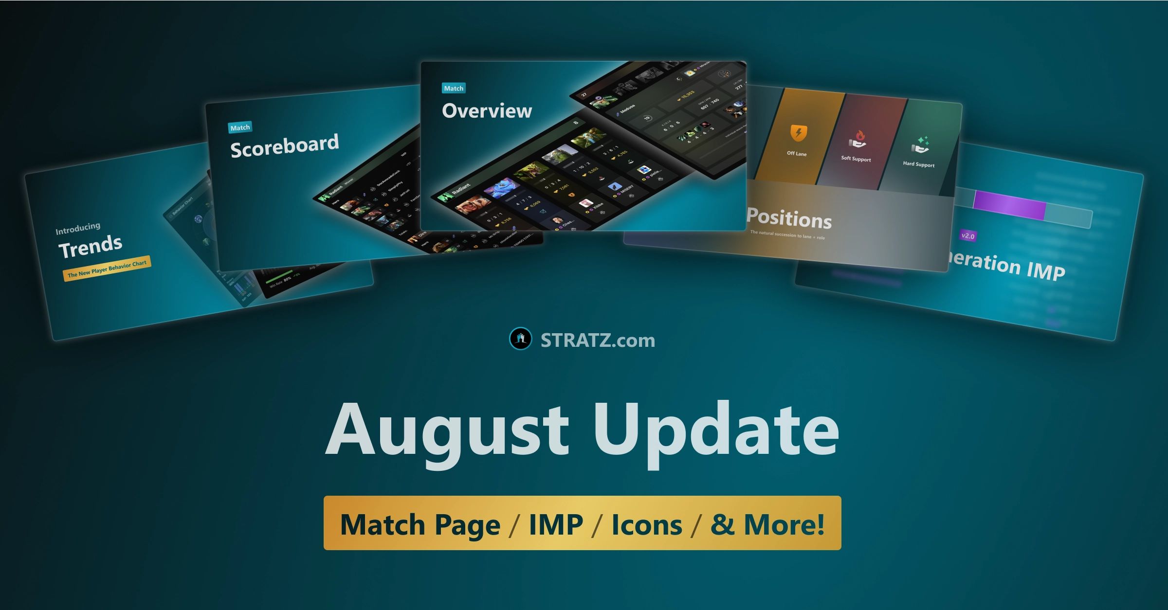
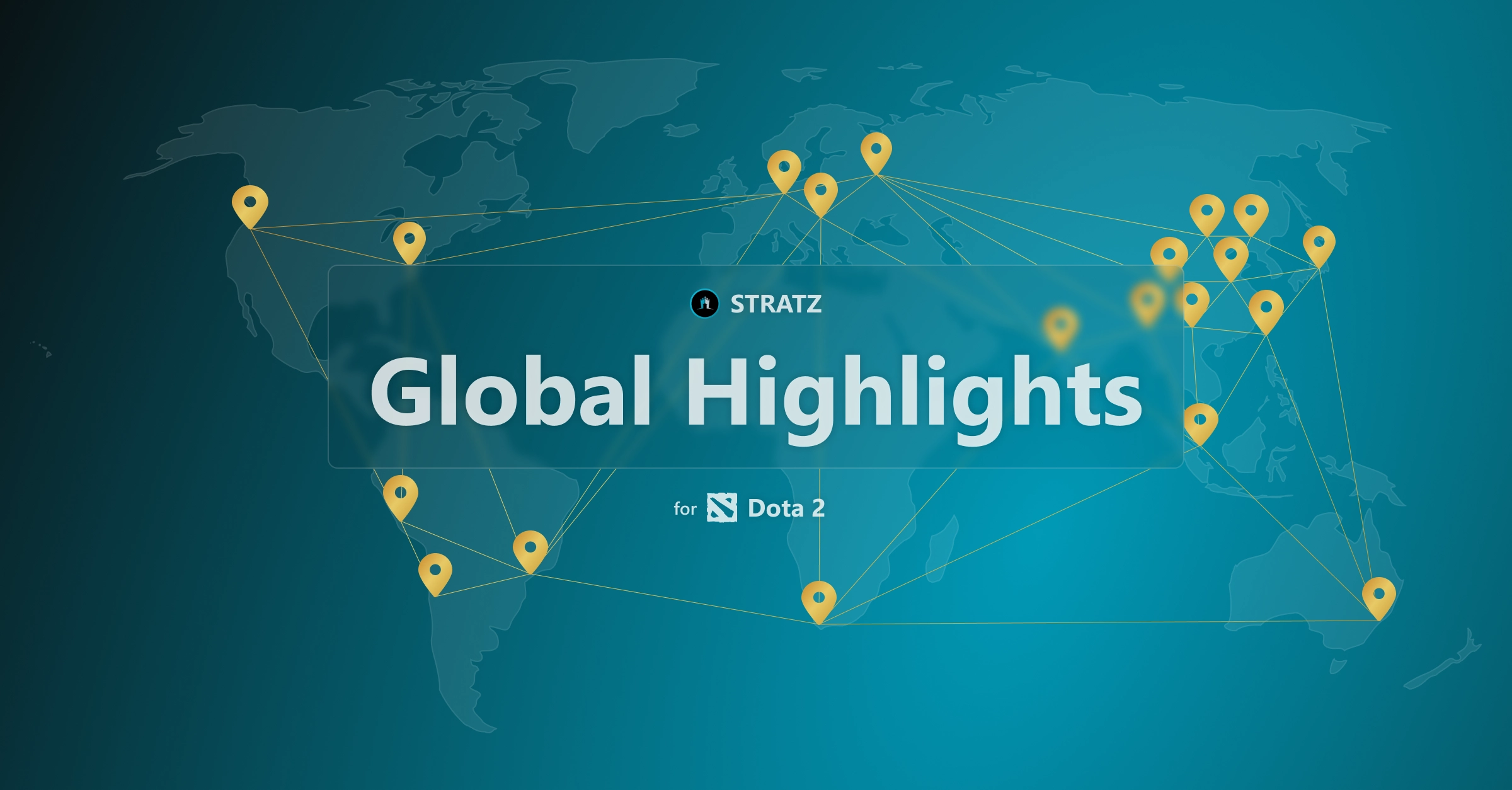
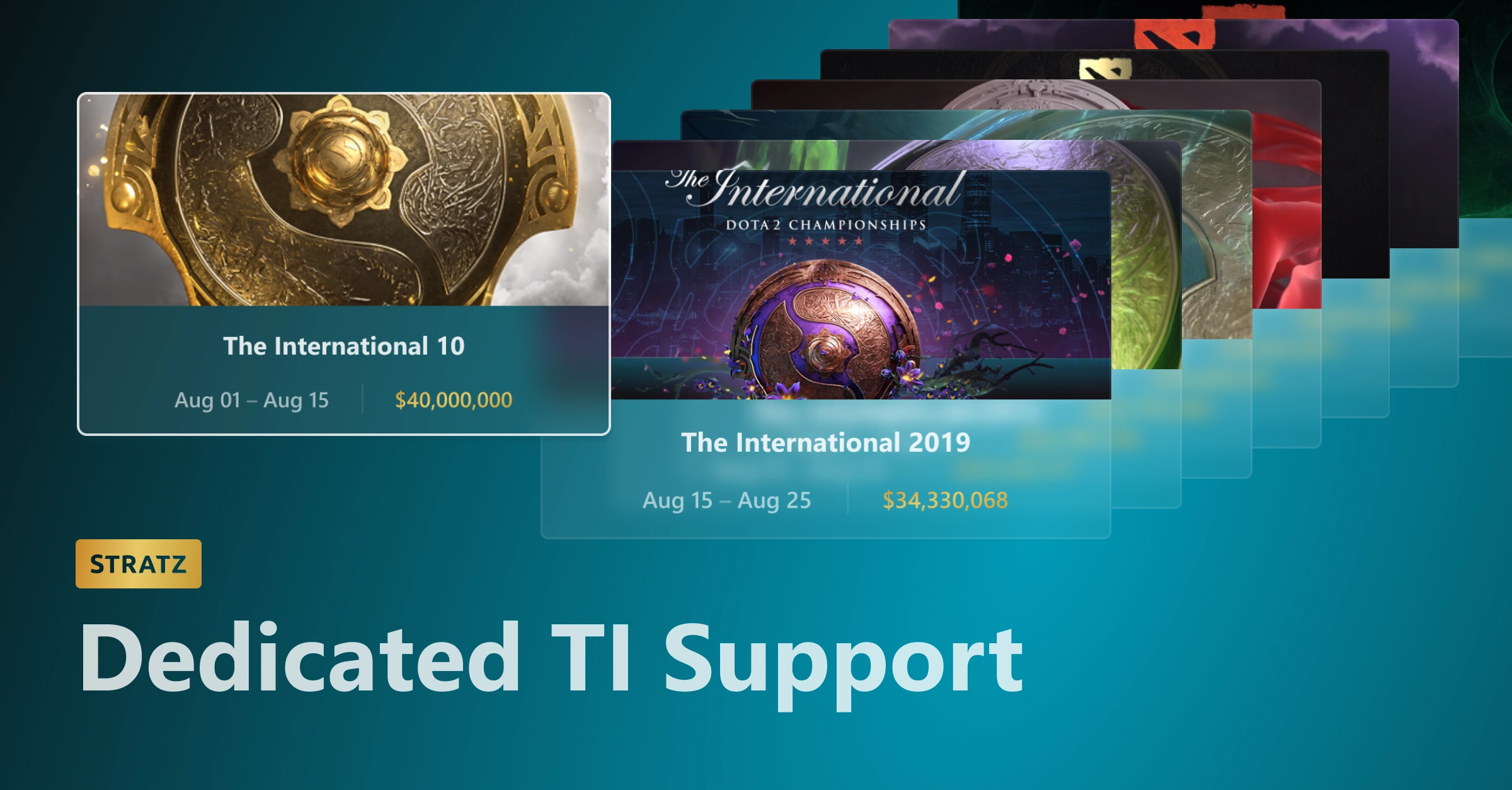
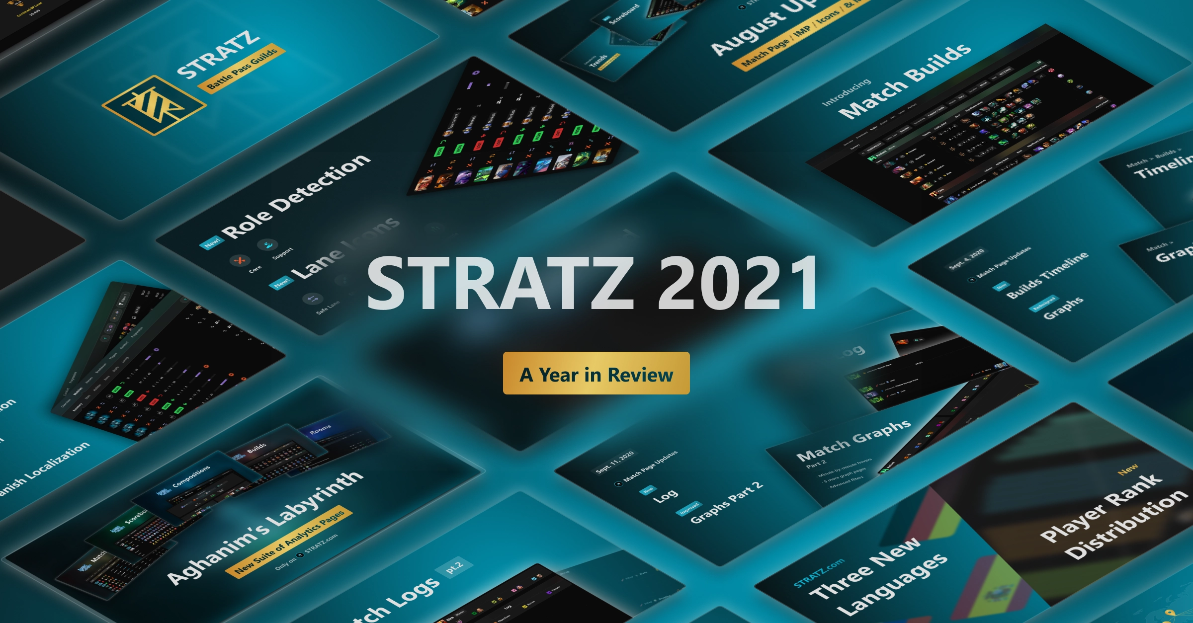
Once a new design is complete, I feature the new functionality in a series of promotional graphics, and it gets announced in a company blog post going into more detail.
Now that the feature is in the hands of the users, I continue to monitor relevant media channels, collecting feedback to take into account for future updates.
Future
I’m happy with how STRATZ has evolved over the course of my work there. As of 2022, the site has grown by 300% in terms of user count, and is continuing its upward trajectory. The design language of the company is refined and matured to the point where many new pages and features can be imagined efficiently and in high-fidelity using our component library. Our users continue to share praise and positive feedback on the site direction.
I’ve also been able to learn a lot about efficient design methodologies, revision processes, and feature prioritization over the course of my time on this project. Design skill is a lifelong pursuit, and I will take these lessons with me into all future projects I undertake.
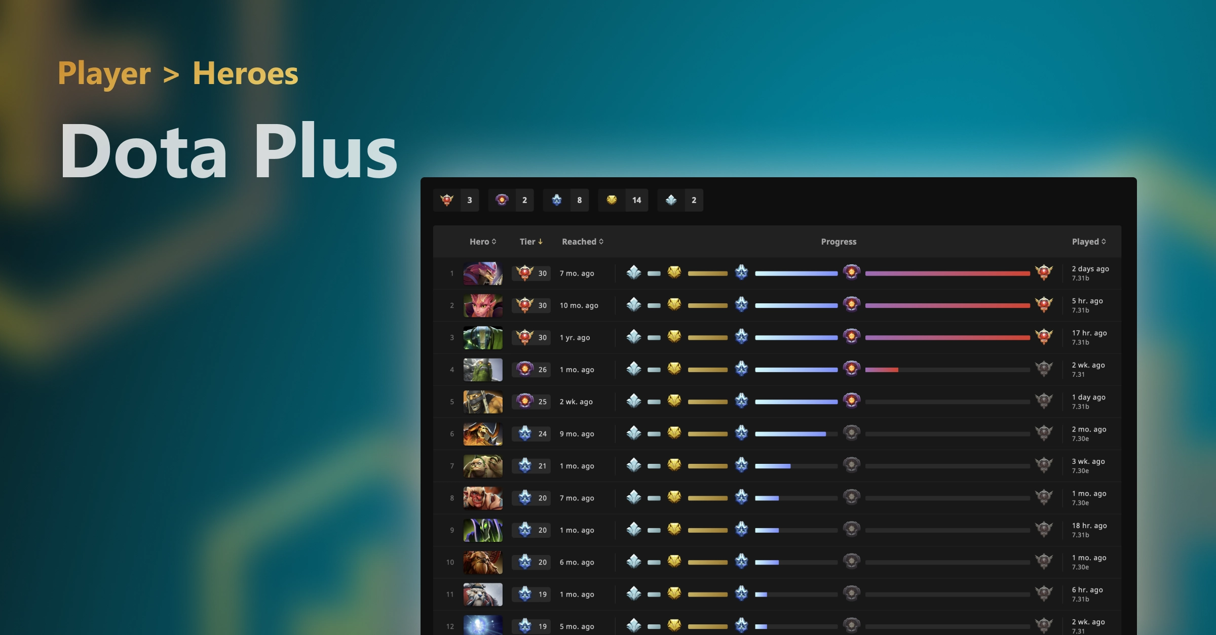
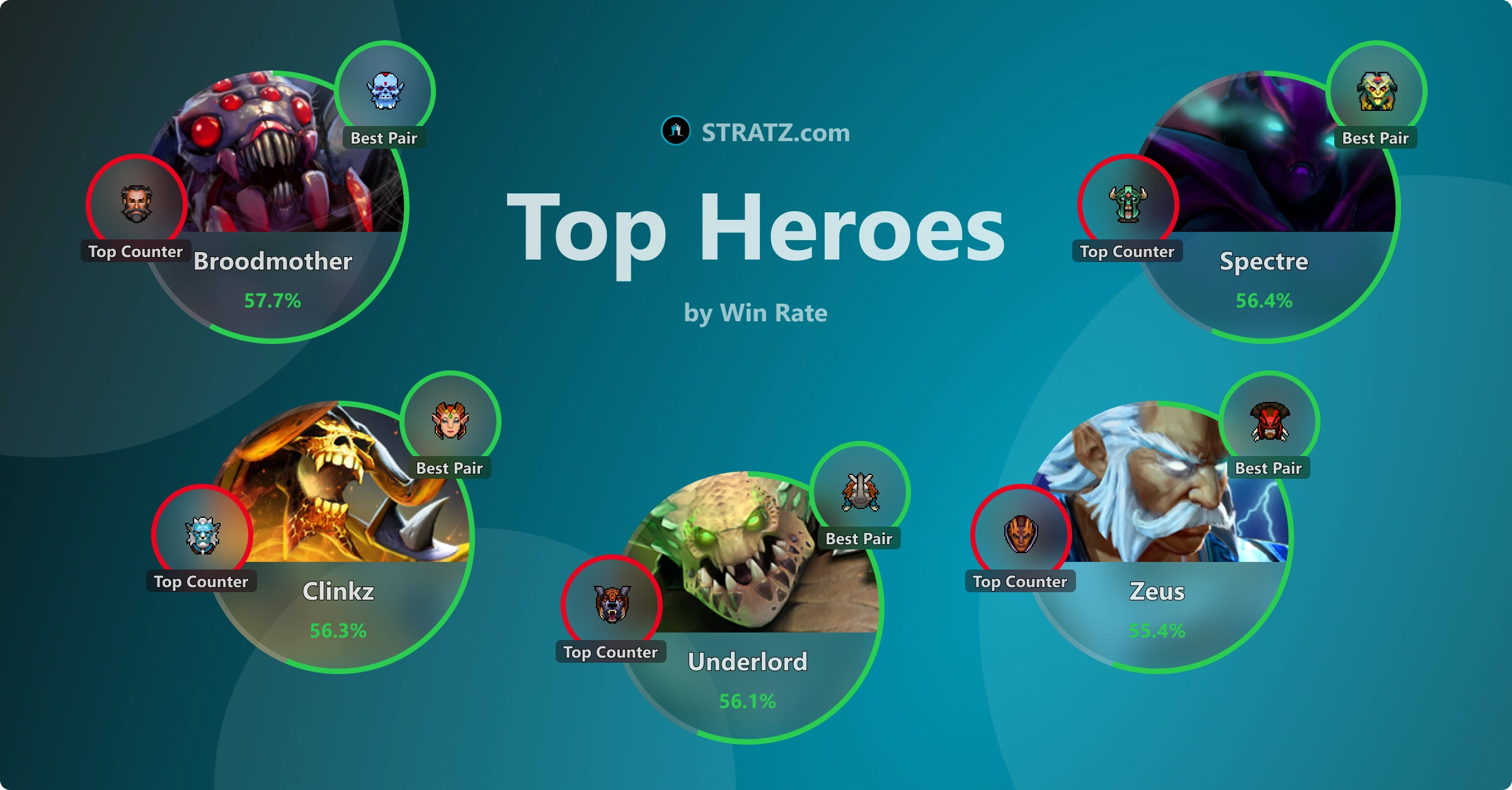
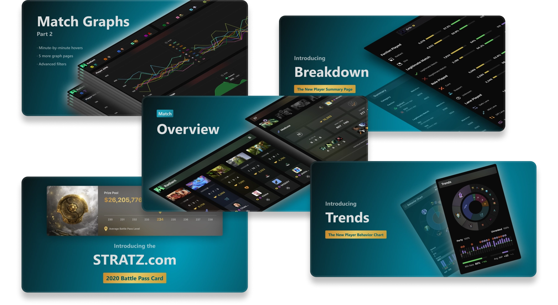
Additional Images