Randleman Program
Overview
As part of my work at the Rochester Institute of Technology (RIT), I supported the development of the Randleman Program with a logo, brand assets, social media materials, and UI design for their webpage.
Deliverables
Logo, Brand Assets, UI
I designed brand assets, business cards, social media graphics, presentations, as well as the program’s webpage on RIT’s site.
Origin
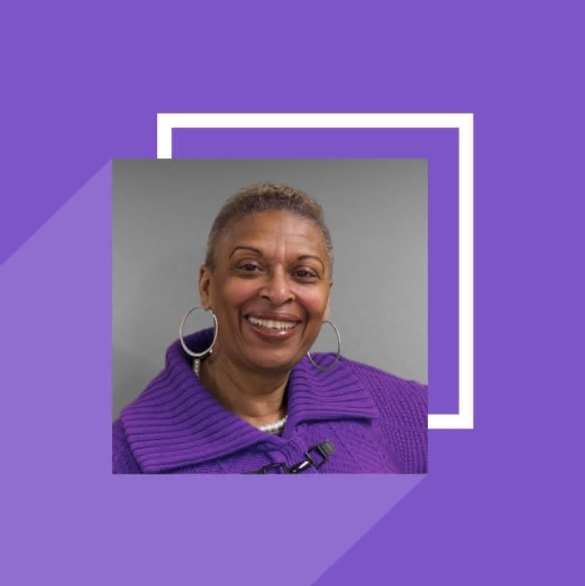
People of color have been heavily undersupported in the field of American Sign Language (ASL) interpreting. To help address this, the RIT Department of Access Services (DAS) started the Randleman Program. Named after Valerie Randleman, the first black interpreter to work at DAS, the Randleman program is a recruiting and mentorship initiative meant to elevate and provide opportunities to interpreters regardless of race, color, and/or national origin.
Logo
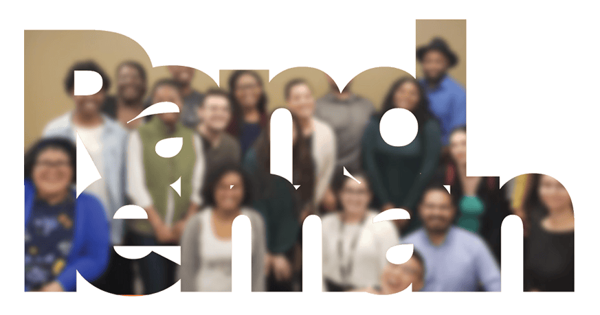
To represent the inclusive nature of the program, I created a logo that captures the key characteristics of the initiative: Two hands form the ASL sign for “Interpreting,” while illustrated waves in 12 distinct skin tones draw the eye into the shapes while emphasizing the beautiful diversity present across humanity.
The organic lines coupled with the geometric repetition around a central point give a mandela-like energy to the design, while still communicating the program’s goals.
Brand Assets

To further support the growth of the program, I created a number of brand assets that align to the RIT Brand Guidelines.
Using brand concepts like tightly-kerned bold text as clipping masks for imagery, geometric shapes and long shadows for photos, and distraction-free background textures, I created all the assets needed for the program’s webpage.
Beyond just the web assets, I designed presentations, business cards, and other such materials for the leaders of the program to further generate awareness.
Webpage Design
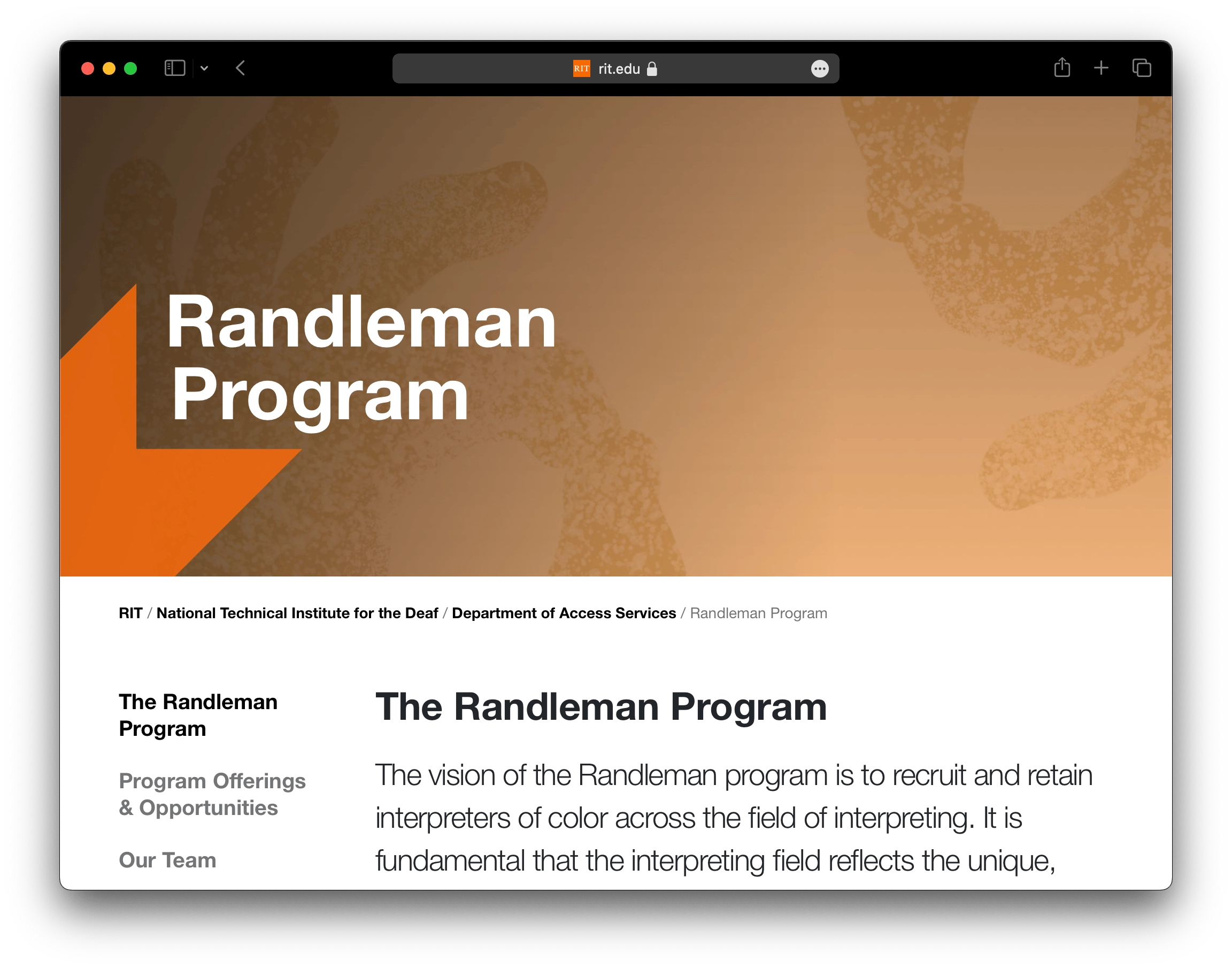
My last deliverable was creating the UI design for the program’s webpage on the RIT website.
RIT has strict design requirements for their departments’ webpages, so I made sure to carefully adhere to the institute guidelines before handing the design off to their development team to be built.
My Work with RIT
The Randleman Program was one of a number of projects I supported while working with RIT. For a complete record of my work there, view my RIT timeline.